Collexia Beyond Payments
- Client:
- Collexia Beyond Payments
- Completion:
- 29 November 2022
- Link:
- https://collexia.co/
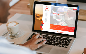
Collexia is live! What a fun design to work on.
Traditionally websites have a horizontal navigation, but this comes with the drawback of having limited space for the needed navigation. It is the responsibility of the designer to get as much information to get a good feeling of how big the navigation might be, and in this case it was just a little more than usual.
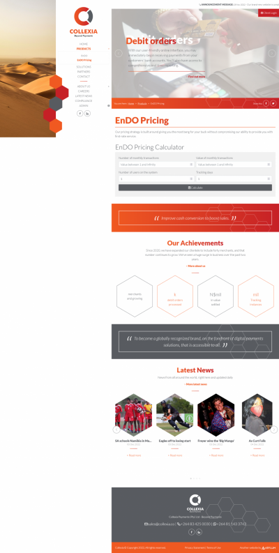
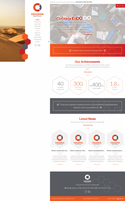
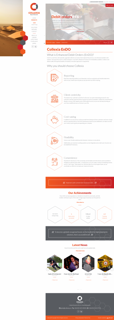
The client handed me a few brochures and a corporate profile, which both had Dunes and the Hexagon shapes in the design. Which is exactly why i used these in the website design:
- The hexagon graphics as frames for the people profile pictures, news and info-graphics.
- The Dunes with the parallax filling the white space for a seamless full-viewport page design and a sense of depth.
This full-viewport design pushed the content area into a manageable with which makes text much more legible and the 16:9 images scale quite perfectly.
As for the client, well, they were awesome! Friendly and understandable when it came to more information I needed to "fill" the website with ... yes, content. 😃
All in all, I really love how this turned out! I am looking forward to expand the website with upcoming additions!
Statistics
Our Clients & Partners
Namibia Tourism Board Events

Avenir Safari Group
ProNam Collective

Omeya Golf and Lifestyle Estate

Quartz Construction
Köpplinger Boltman Van Greunen
Heinitzburg Boutique Hotel

e.power
Association of Consulting Engineers of Namibia

HPCNA
Roof of Africa

Schonfeld Safaris

Namibia Film Commission (NFC)

Granietkop Campsite
Namibia Health Plan
Amazing Trails

Debmarine Namibia v2.0
Emcon Consulting Group
Ugab Game Farm and Lodge

Collexia Beyond Payments
Lewfin America LLC
Deepcatch Holdings Namibia

Namibia National Olympic Committee

NamPower Virtual Tour
Copper & Coal Distillery Namibia

Oshakati Premier Electric
Aucor Online Auctions

Pointbreak Wealth Management

Namibia Breweries Limited

Ultimate Safaris
Nammed Medical Aid Fund

Melbic Car Rentals, Transfers & Tours
Journeys Namibia

Ellis & Partners
Otjiwa Lodge

Namibia Wildlife Resorts (NWR)
BankMed Namibia

Nampost

Barkhan Dune Retreat
NIPAM
Kosmos 94.1

NMC
Agribank
Debmarine Namibia v1.0
MTC
WHK Law

